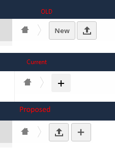
I would understand that buttons are collapsed in a responsive way in small screens, but in a regular desktop screen there should be space enough to show two or three buttons separately.
So let the apps add more buttons, but upload button should be the first main button, then weather “+” and inside of it, or next to it doesn’t matter (to me). I have OC 8.1 with 2 buttons (base version without apps, etc.) and I can’t believe in OC 9+ need to always click twice to upload.
Thanks!
I merely navigate to directory file should be uploaded to, and then drag & drop. If this were not possible I could see how the unnecessary clicking could create a hindrance, especially if you do that sort of thing all the time. I personally do not utilize the web interface much for file uploading so this is not huge deal to me.
Drag and drop works, but based on my experience with UIs, the idea is to make it easy to use, comfortable, easy to learn, and intuitive.
The fact that you don’t use UI “I personally do not utilize the web interface much for file uploading” does not mean the UI should not be pleasant for others.
Making someone need to click twice for some frequent operation makes no sense. I also noticed many people follow facebook UI style. Make a shape and let someone guess what does it mean, the “label-less user interface”. For the mobile world yes, low space, make smart UIs, sure, but in OC case I don’t believe 1 vs 2 buttons is a big deal even for mobile screen.
As well as separating buttons, perhaps we could have tool-tips too, instead of having to click everything to find out/remind ourselves of the action. Or are tool-tips forbidden in this New Design Era?
Each title has many potential complications: translation is only the most obvious. Intuitive, ergonomic icons across linguistic and cultural borders are really difficult, but in some ways text is even more so. E.g. ‘black’
At least you didn’t use ‘snow’ as an example. I don’t ask for subtlety, just short phrases such as ‘Upload a file’, ‘More actions’ or ‘Add new …’.
Sorry, this kind of tool-tip is not difficult and is a well-established way of imparting additional information to the user. Just because it has been in use for a long time doesn’t mean it has to change – quite the reverse, in fact: it’s what a desktop & mouse user expects. Yes, some of the users are working at a keyboard and mouse.